other works
(niy43)
years one to three
OVERVIEW

"tickitnow"


this project is a ticket-purchasing app designed to simplify how users discover, compare, and buy event or travel tickets in a clean, intuitive interface.


inspired by neo-brutalist UI trends, the app blends bold layouts, vibrant colours, and clear visual hierarchy to appeal to young adults. the design focuses on fast navigation, straightforward information, and engaging visuals that make browsing events effortless.


by organising content into clear sections and prioritising user-friendly interactions, tickitnow reimagines the ticket-buying experience as smooth, accessible, and visually refreshing.

OVERVIEW

two storey terrace house


this two-storey terrace house was designed using japandi–scandinavian inspirations, focusing on natural light, clean lines, and calm, home-centred living.


the plans and elevations reflect the client’s lifestyle needs — from open family areas and crafting spaces to cozy bedrooms and an intimate second-floor retreat.


by blending warm wood textures, minimal forms, and functional zoning, the layout creates a simple, comfortable home that supports everyday activities while feeling airy, natural, and refined.

OVERVIEW

vans store


this vans visual merchandising concept reinterprets vans in a more experimental and atmospheric way, using rugged rock formations, concrete textures, and dramatic lighting.


guided by my research on its store analysis — especially on materiality, mood, and sensory experience — this design explores a darker, more immersive environment where shoes become standout elements against raw, textured surfaces.


it pushes vans’ identity beyond retail, turning the space into a bold, sculptural installation.


*it was a groupwork that had a mix of different brands in one store, and my area was specifically vans.

OVERVIEW

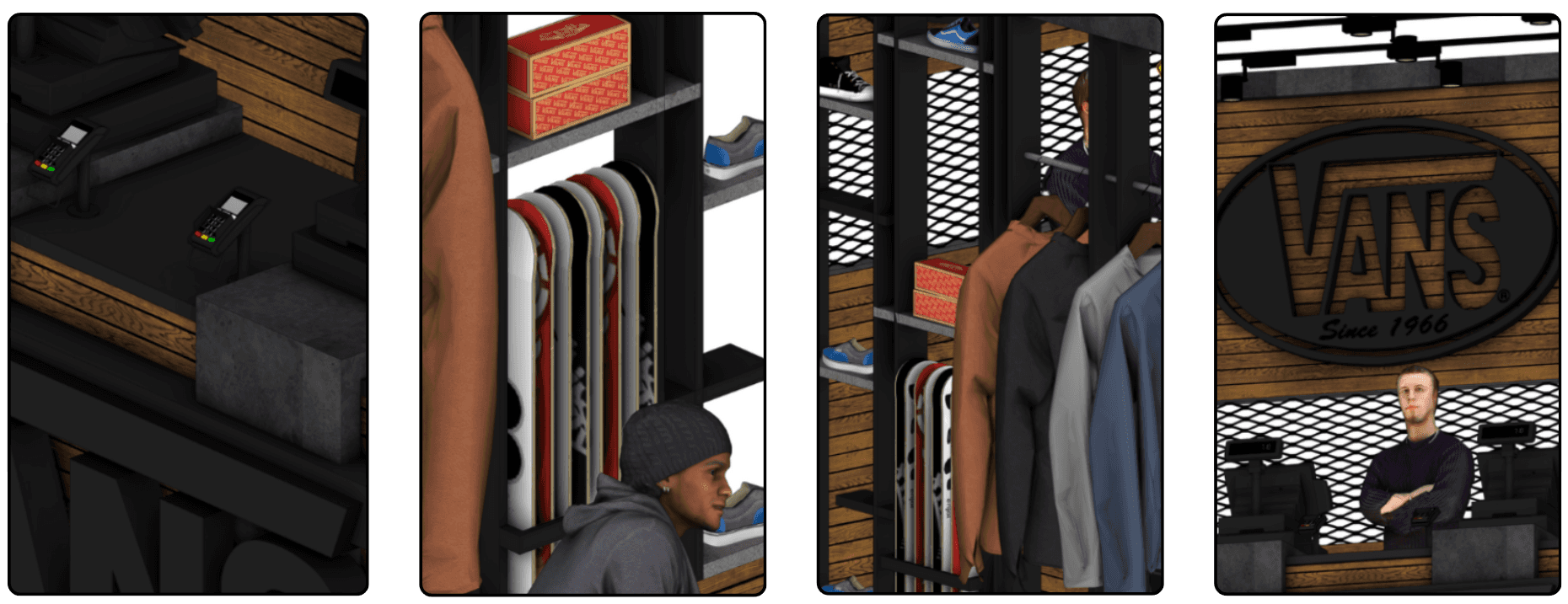
vans pop up store


this pop-up booth interprets vans’ brand identity through a compact, functional retail space inspired by my on-site research at tampines 1. the design blends dark wood, metal grids, and the iconic checkerboard motif to capture the brand’s urban, skate-influenced character.


the layout is intentionally straightforward, guiding customers from product browsing to checkout with minimal obstruction. every element — from the ceiling tracks to the merchandise wall — reflects the clean, structured visual merchandising strategies observed in your design journal. this booth distils vans into a small, impactful unit that feels authentic, practical, and visually recognizable.

footer
(niy43)
interior designer

Create a free website with Framer, the website builder loved by startups, designers and agencies.